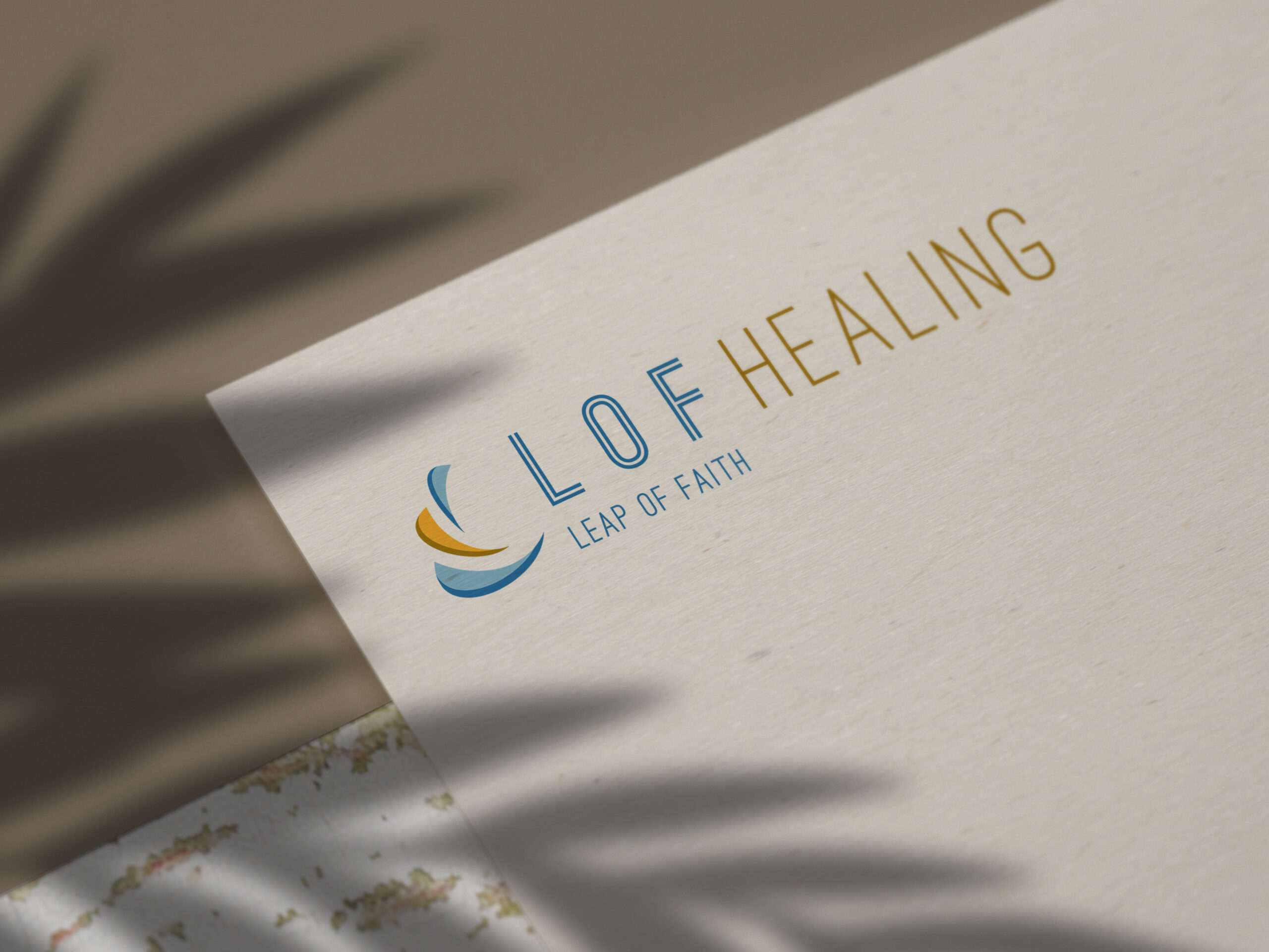
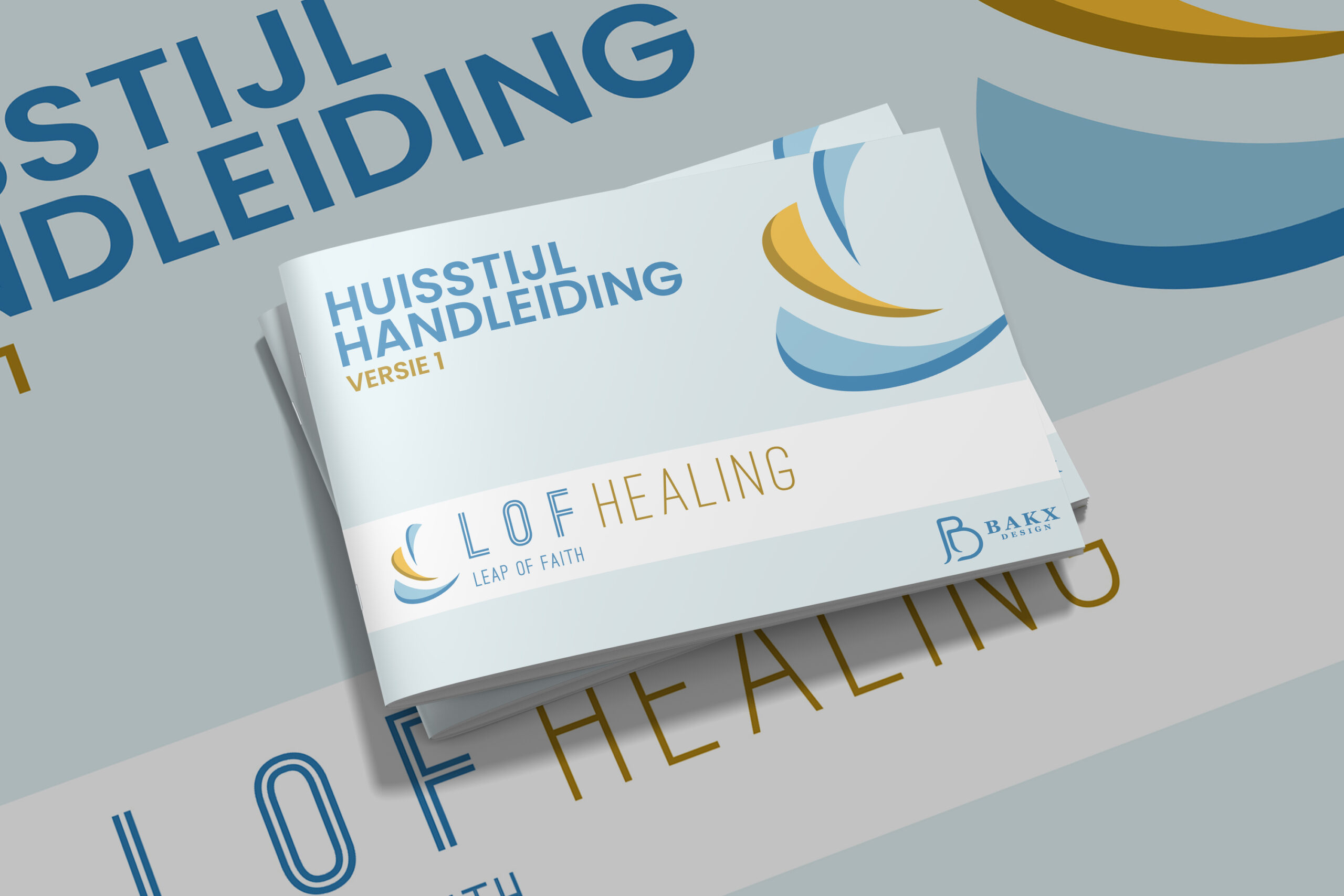
In this project, the way of working was some what different than the usual. The client wanted to take an active role in the design process, so during this time, we had close contact with her.
This resulted in a special collaboration where the client could really express herself, which made the result really fit to the business.
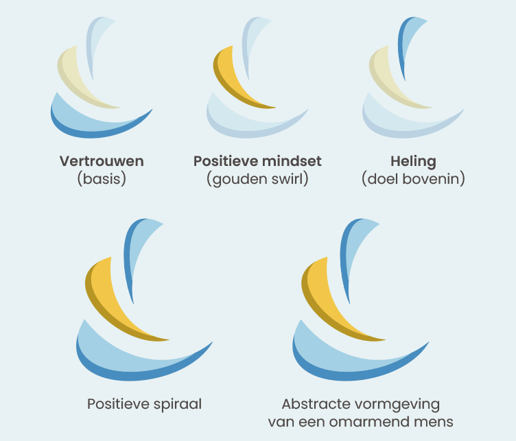
To visualize this company, we had several short meetings with our client to identify her daily actions, her style and what she would like to express in her business. We came to the conclusion that the company should have a clear, straight-forward and down-to-earth feeling, so that her clients know what they can expect.


